You may remember that there was a football game a couple of Sundays ago that ended in dramatic fashion. As the clock ticked down to zero and players and media spilled onto the field, no one knew quite what to make of what had just happened. It took color commentator Cris Collinsworth a few minutes to get over his shock at the Seahawks’ last play call. Game-winning hero Malcolm Butler could barely speak. I had only one question: Is Patriots owner Bob Kraft really going to accept the Lombardi trophy wearing a matching tie-and-pocket-square set?!?
Matching ties and pocket squares are alternatively derided as feminine, tacky, unimaginative. Few sins are considered more heinous by stylish dressers. There is some justification for this opinion. A pocket square is a rare enough thing already, and is essentially useless. Its wearer therefore risks looking too ornamented, too prissy, too ostentatious. To counteract this, the pocket square must be worn with as much insouciance as possible. It should look like something chosen at random and stuffed in the pocket at a whim, even if it has been chosen and folded with great care.
If the pocket square matches the tie, all pretension of disinterest is lost. Not only does the matching color draw more attention to both items, but it makes clear that the wearer has chosen a very specific pocket square. We must consider the harrowing possibility that he never wears the tie and pocket square apart, which then raises the specter of unseen matching suspenders, or even underwear.
Consider as an alternative the above photo of the stylish Erik Mannby (aka EFV). No colors are repeated - green jacket, light blue shirt, brown hat, purple tie, and an orange cardigan, with a cream hank in the jacket pocket. Despite a total avoidance of the most common menswear colors of navy and grey, the whole thing pulls together nicely. If the pocket square were a purple to match the tie, or still worse orange to match the cardigan, Erik turns into a pumpkin.
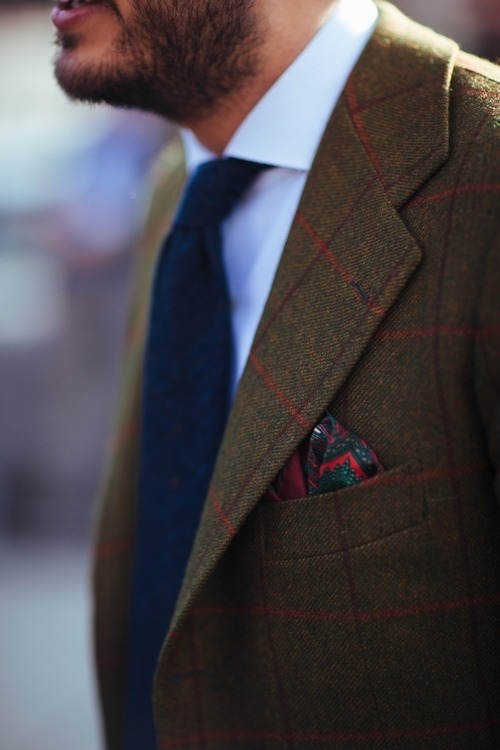
Erik’s outfit works because it’s all fall colors, but this balance is delicate. If you want a lower risk strategy, try instead choosing a pocket square that picks up a secondary color in your outfit, as with this red square that echoes the check on the jacket:
Then we can both pretend it just happened by chance.
Quality content, like quality clothing, ages well. This article first appeared on the No Man blog in February 2015.